You may notice we look a little different. Health Access has unveiled a new logo and website that better reflects our bold advocacy for California’s health care consumers. It’s still the Health Access you’ve grown to know over the last 35 years, but now with a new style.
Our new logo adapts to the changing demands of a digital age that requires a diversity of applications and a more comprehensive color palette.
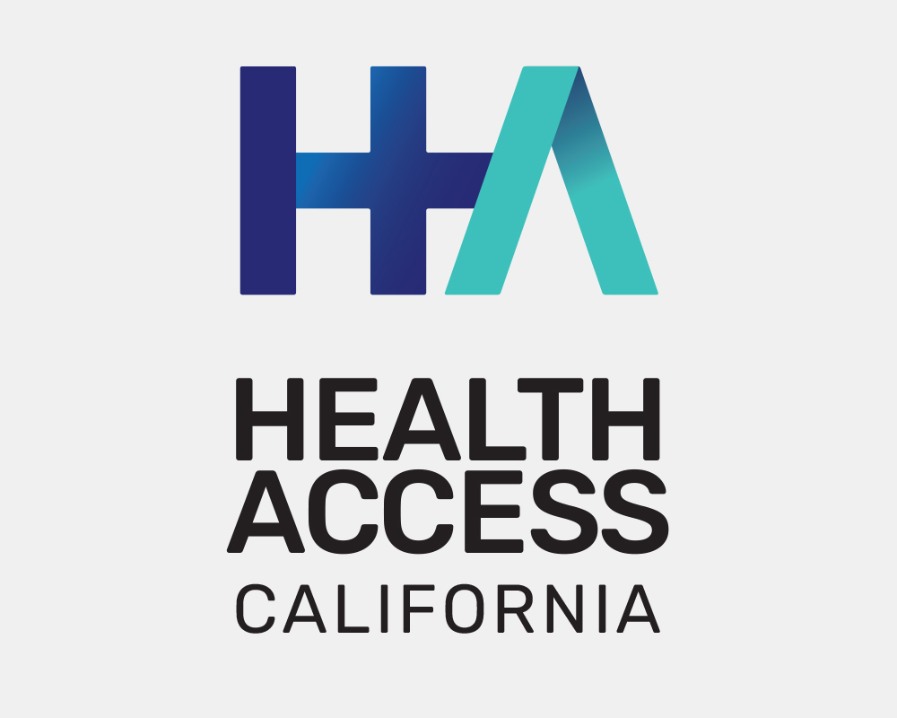
The logo has a number of images embedded within it that helps tell our story. A + indicates our goal to grow our health care system with intention, leaving no one out. It also signifies our added value to health policy discussions in the Capitol and beyond. A > points to our forward movement that is only possible when we work together. As a coalition, our voices are more powerful when we speak as one.
Our new website also reflects these values: making our work more accessible, understandable, and dynamic. We want all Californians – from policymakers to consumers – to be able to use our website as a source of information on our health care system, and how you can take part in changing it for the better.
Our logo may have changed, but our mission to provide quality, affordable, and equitable health care to ALL Californians has not.
To learn more about our new logo, please watch our video: